Clarity Theme for Hugo Released

"Out with the old, in with the new," they say. And today, there's a whole lot new. In particular, there's a whole new look to Neon Mirrors complete with custom branding and a brand spanking new logo. But the main subject of this post is to announce a new theme in which the site has been reskinned and appears before you now. Not just any new theme, but a custom-built, from-scratch Hugo theme adopting VMware's Clarity Design System. And not only that, but it has been donated to the community and accepted as an official Hugo theme! So if you love the look and feel of Clarity and want to enable it for your own blog with Hugo, you can now do that with ease. In addition to it being very customizable, it has some very slick features we technologists often use. I want to highlight some of these features and how you can get started and making it work for you.
I initially launched neonmirrors.net at the beginning of 2020 using an existing Hugo theme that was fairly heavily tweaked. But in the back of my mind, I always liked the look of Clarity and how clean it was and so wanted to see if it would be possible to build a theme for my own blog. I knew that it was based on some others in the community having done that for themselves, but I wanted to go a couple steps further and tailor it particularly to technology articles and then make it available to everyone else to adopt in an easy manner. Over the course of the past six months or so, I have been working with a very talented developer, Dan Weru, to deliver on this vision, and so today we want to officially announce this theme to you.
Although we mention it in the theme page, there are some major features we spent quite a lot of time developing that we'd like to call out. The first is the dark mode.

We know that dark mode is quite popular amongst many of us in the technology space, particularly in our favorite IDE of choice, so we wanted the theme to reflect that as well. Clarity for Hugo allows you to set the theme to your liking, but it also auto-detects the mode you have set on your system and switches to that by default. So if you like your Mac to always stay on dark mode, when you visit the theme page, for example neonmirrors.net, the site will instantly switch to dark mode. Try it out now and see what you think.
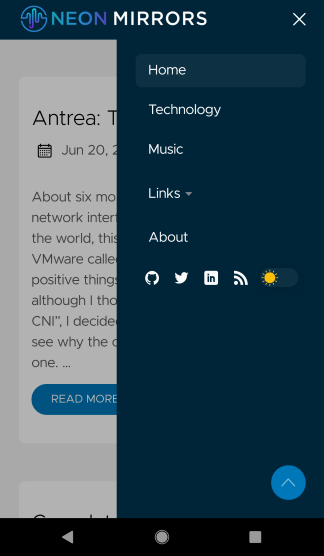
Next up is mobile support with a customizable fly-out menu controlled by a parameter in the config.toml file and a "to top" button particularly helpful for Android users. By setting the mobileNavigation parameter, you can control whether that menu opens to the right or left. And the dark/light theme auto-switching also works on mobile, so if you like dark mode on your iPhone or Android, this should just work out of the box. We've fully tested all the major devices, platforms, as well as browsers, so you should be good to go no matter where your users open your site.
And saving the best for last is a set of all new, rich code formatting functions, written from scratch by Dan. We got the idea for these based on a combination of some other blogs out there and also the Crayon Syntax Highlighter plugin for Wordpress. While we liked many of the ideas in this plugin, it only works for Wordpress and is fairly complex. Plus, there are some features that are not super useful. So we took the best of all parts and distilled them down into a set of five essential features we think everyone would use. Let's go through these individually as I think they are what makes this theme really shine.
First, is the copy to clipboard function. Fairly self explanatory there and also not uncommon. All code should be copyable without having to manually select all and copy. This simple button in the top left does that.
1hugo new site yourSiteName
2cd yourSiteName
3git init
4git submodule add https://github.com/chipzoller/hugo-clarity themes/hugo-clarity
5cp -a themes/hugo-clarity/exampleSite/ .
You'll also notice how as soon as you roll over the code block area (or interact on mobile), those functions will be visible. This is to maintain the spirit of Clarity and being minimally disruptive to the visual flow of the content. Code blocks also have nice, rounded edges to them as well.
Second, is the ability to toggle on/off line wrapping. When code spills over the edge of the fenced block, you can now choose to wrap that around so everything is visible. Try it by clicking the toggle line wrap button on the far right.
1./Optimize-VMwarePKS.ps1 -TidyFolders -TidyTags -vCenter $vc -vCenterCredential $credvC -PKSSever $pks -PKSCredential $credPKS
Also, compare this code block with the first one. Notice anything? How about how that button wasn't present in the first code block? That's right, the toggle line wrap button is dynamic. If you are showing code which fits in the confines of the block, the button will not appear because there's nothing to wrap. Eliminates button complexity which furthers the ideals of Clarity.
Third, we have the ability to toggle line numbers on or off. Also a somewhat common code ability, but here is taken a step further. We give you the controls to enable/disable this globally by setting the codeLineNumbers parameter in your config.toml file to either true or false. But we also allow you to override this on a per-article level if you want by configuring the same parameter in your front matter. So if you prefer to have line numbers not show for all articles but you do want them to show for one article in particular, you can do that. Try toggling line numbers on and off below.
1{
2    "name": "lb-medium",
3    "description": "Network profile for medium NSX-T load balancer",
4    "parameters": {
5        "lb_size": "medium"
6    }
7}
Fourth, is the ability to display the language used in your code block. This language is specified in the code fence in your markdown and handles syntax highlighting, but we wanted to display what was used just as an extra help for users to be able to locate code blocks. Now you can see this plainly without having to read and parse the code directly. Also note how when you roll over the code block, that language label dims slightly so as to draw your focus to the code function buttons above. And if you don't wish to specify a language label, like I've done below, nothing will get diplayed.
1cp thumbnail.png ..\..
And last but certainly not least, number five, is a code expansion and contraction function. Very often, we have fairly long scripts or other text-based files that we want to display, but don't necessarily want to take up screen real estate. This is especially useful when you're coupling a long script with line numbers in order to illustrate to your readers what sections perform what tasks. One of the nice features of this theme is to set how many lines you want to display, and then allow users to, at their discretion, expand the code blocks when needed. Try it on this sample Kubernetes resource below by clicking on either the ellipsis at the bottom of the code block, or the expand button in the control palette at the top right. Both perform the same function. Once the code is expanded to full size, it can be collapsed once again by going to the same button.
 1apiVersion: rbac.authorization.k8s.io/v1
 2kind: Role
 3metadata:
 4  name: example
 5rules:
 6- apiGroups:
 7  - ""
 8  resources:
 9    - pods
10  verbs:
11    - get
12    - list
13    - watch
14- apiGroups:
15    - apps
16  resources:
17    - deployments
18  verbs:
19    - create
20    - delete
21    - patch
22    - update
Also, we give you more control over the granularity of this option like line numbers. You can set the parameter codeMaxLines in your config.toml file to the number of lines you wish to display globally. Any lines after this will be auto-collapsed. But, once again, you can override this on a per-article basis by setting the same parameter name to a higher or lower value, it's up to you. The value set, if present, on that article wins. And as a last step, if you didn't want to bother with this parameter at all and omitted it from everywhere, an internal default of 100 lines will apply.
I've run through only the major features of our new Clarity theme, but for more details and all the options available, check out the readme over in our repo. This project has been a lot of work over the past several months, but we're super happy to now be sharing it with the world. Try it out, give it a spin, and let us know how you liked it. Find some "oops" moments or want to request an enhancement? We'll be maintaining this theme over time, so file everything as an issue with a description of what you'd like differently and we'll consider it.